Picture a shopper landing on your store for the first time. Within a couple of seconds, before reading a single product description, they have already decided whether your business feels trustworthy. That decision rests almost entirely on Shopify website design: the layout, the spacing, the way your homepage guides their eye. Get it wrong, and no discount or ad budget will save the sale.
Here is the part that surprises most store owners: good design rarely means "more." It means removing whatever distracts a visitor from deciding to buy. We will walk through the UI/UX principles that matter most, illustrated with examples from stores we have worked on across India and abroad. If you already have a theme in place and just want hands-on tweaks, our Shopify theme customization guide walks through the mechanics; this article focuses on why those choices work.
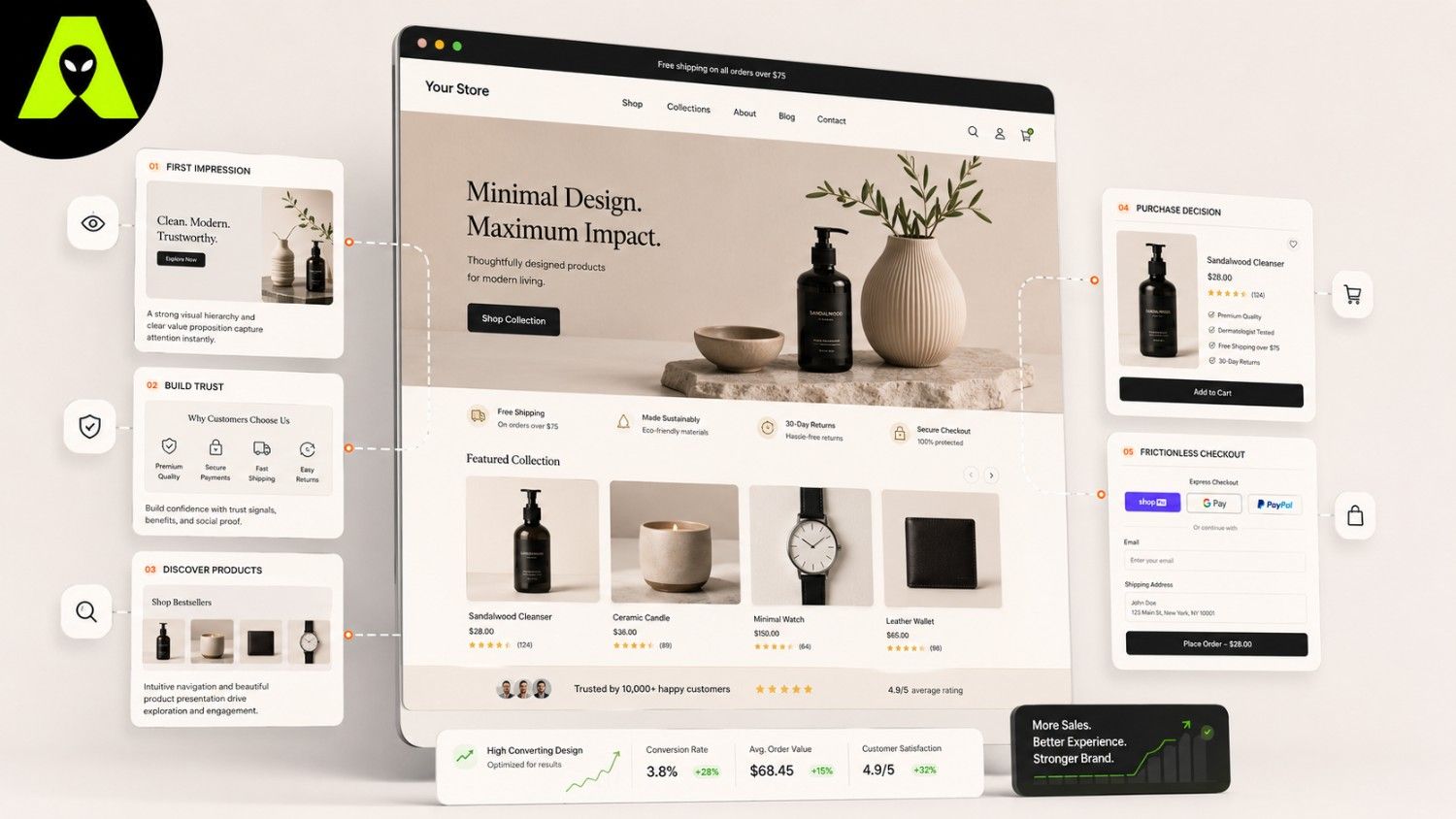
Eyes move in predictable patterns. On most product pages, a visitor scans the hero image, then the price, then the button that lets them act. If any of those three elements fight for attention, hesitation creeps in, and hesitation is where sales quietly disappear.
New visitors have no history with your brand, so they look for shortcuts that suggest you are legitimate. Real customer photos, honest reviews, and clear shipping or return policies do more heavy lifting here than any clever headline. A boutique we worked with near Mohali doubled its checkout completion simply by moving its return policy from a buried footer link to a visible line near the buy button.
That kind of change costs almost nothing to implement, yet it directly addresses the hesitation a shopper feels right before paying. Trust signals are not decoration; they are answers to questions your visitor is silently asking.
Not every design change deserves equal priority. Mobile layout usually matters most, since most Shopify traffic arrives on a phone, followed by checkout friction, then overall visual polish. Consequently, a store with a beautiful desktop homepage but a clunky mobile checkout is optimizing the wrong screen.
Ecommerce UX design also benefits from small, testable changes rather than a full relaunch. Swap one product photo, shorten one form, and measure what happens before touching everything else at once. If your current design needs a broader rebuild rather than small fixes, our Shopify development services page outlines how we approach that project.
Shopify design has to guide a purchase decision, not just present information. Every layout choice should reduce friction between browsing and checkout.
Yes, consistently. Clearer layouts, visible trust signals, and simplified checkout flows tend to reduce cart abandonment noticeably, even without any change to pricing.
Usually not. Testing one change at a time, such as your checkout flow or product page layout, shows you what actually moves the needle before you commit to a full rebuild.
Shopify website design is not about following trends; it is about removing the small frictions that make a visitor pause instead of buy. Start with mobile, add trust signals where hesitation lives, and let real behaviour guide the rest.
Want a second opinion on where your store is losing shoppers? Get in touch with the Alien Web Solutions team — we will walk through your store honestly and point out what to fix first.